Full prompts
Chinese prompt
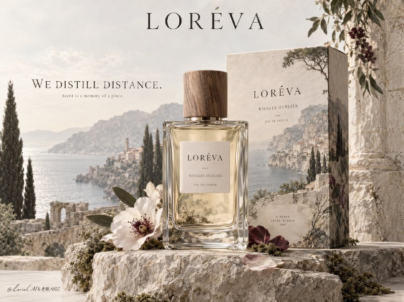
为一个名为 LORÉVA 的虚构高级定制香水品牌创建一张博物馆级香水广告主视觉图,设计成一个单一、提升感的编辑式构图,让真实香水瓶及其包装成为诗意景观装置的中心。将参考图的结构智能作为纯粹的设计逻辑来保留:前景中一个居中的矩形玻璃香水瓶,其后一个略高的包装盒,下方一个雕塑感矿物底座,以及一个柔和消散的目的地世界在产品背后并部分穿过产品展开。最终图像必须比传统香水广告更艺术、更克制、更奢华,同时像一张值得收藏的画廊海报和高级时装网站主视觉。

产品是绝对主角。瓶身必须写实且精致渲染:厚实透明的玻璃壁、优雅比例、浅色发光的香水液体、细微折射与反射、清晰的肩部边缘、带可见木纹的温暖天然木瓶盖,以及带精致字体的干净标签。其后的包装盒必须像一件高级纸质物件,具有可触摸的哑光质感和柔和风化的印刷图像,延续同一种氛围化景观语言,仿佛香气的世界住在包装之中。瓶身必须通过清晰、静止和材质精度占据主导,而盒子作为安静的建筑式支撑。

概念是:香气包含一个地点,但这个地点以记忆而非插画的方式呈现。构建一个浅淡、有文化感、绘画式写实的地中海景观,从产品背后和周围升起:褪色的海岸山脉、远处海岸线、柏树剪影、柔化的石头村庄、矿物感空气,以及克制的植物痕迹。这个世界应像被时间冲洗过,几乎如修复过的湿壁画或手工着色的风景记忆,而不是字面意义上的旅行明信片。环境图像应轻柔地溶入浅色背景,并部分融入盒子表面,形成一种印象:香水是氛围、距离与静默的容器。

在底部,用浅色岩石、苔藓、风化石头、低调干枝、一两朵柔和色调的花,以及精致的半透明花瓣,构建一个雕塑感静物底座。这些元素必须显得经过策展且极简,绝不拥挤。静物应像香氛祭坛一样支撑瓶身,而不是装饰性陈设。减少任何不必要的道具堆砌,让空白在构图中发挥主动作用。

色彩层级:60% 羊皮纸象牙色、石灰岩米色、粉笔白和浅矿物纸色调;20% 苔藓绿、柏树绿、干橄榄色和柔和植物灰绿色;15% 暗淡酒红、灰尘感李子色、褪色赭色和花卉勃艮第色点缀;5% 透明玻璃高光和清晰深色字体。光线柔和且智能:来自左前方的漫射日光,玻璃下方精致聚集的阴影,瓶身边缘细微的高光线,穿过液体的安静辉光,以及景观场域中的大气纵深。保持低对比但高级,通过材质反应而非强烈戏剧光实现体积感与分离度。

字体必须更冷静、更少、更高级。将品牌名“LORÉVA”置于顶部中央,使用精致的高对比衬线字体,并保留充足呼吸空间。在左侧开放空间,只放置一句优雅衬线大写声明:“WE DISTILL DISTANCE.” 在其下添加一行非常小的辅助文字,简短而聪明,内容关于香气、记忆与地点。保持所有其他界面文字极少或几乎不存在。字体应像豪华展览版式的一部分,而不是商业网页横幅,并且绝不能与瓶身竞争。

材质语义必须明确且精致:厚玻璃折射、哑光纸盒纤维、天然木纹、柔软石粉、半透明花瓣脉络、克制的花卉深度,以及氛围化景观颜料的柔软感。物体与世界之间的融合必须无缝,仿佛香水把一整片地理凝结进一个容器。每个元素都应显得有意图、稀有化且平静。

渲染目标:写实奢华香水广告、精美艺术静物精度、编辑式高级感、高端印刷质感、产品主导层级、克制的视觉诗意、优雅负空间,以及国际画廊级审美。

结构化排除约束:不要真实香水品牌名,不要复制文本,不要拥挤花卉,不要过多装饰性水晶,不要扭曲瓶身几何,不要变形标签,不要不可读字体,不要随机字母,不要浑浊颜色,不要肮脏雾感,不要繁忙道具陈设,不要风格漂移,不要廉价美妆电商感,不要 AI 伪影。
English prompt
Create a museum-grade fragrance advertising hero image for a fictional couture perfume house named LORÉVA, designed as a single elevated editorial composition where a real perfume bottle and its packaging become the center of a poetic landscape installation. Preserve the structural intelligence of the reference as pure design logic: one centered rectangular glass perfume bottle in the foreground, one slightly taller packaging box behind it, a sculptural mineral pedestal beneath, and a softly dissolved destination-world unfolding behind and partly through the product. The final image must be more artistic, more restrained, and more luxurious than a conventional fragrance ad, reading like a collectible gallery poster and a high-fashion website hero at the same time.

The product is the absolute hero. The bottle must be photoreal and exquisitely rendered: thick transparent glass walls, elegant proportions, pale luminous fragrance liquid, subtle refraction and reflection, crisp shoulder edges, a warm natural wood cap with visible grain, and a clean label with refined typography. The packaging box behind it must feel like a premium paper object with tactile matte texture and softly weathered printed artwork, extending the same atmospheric landscape language as if the scent’s world lives inside the packaging. The bottle must dominate through clarity, stillness, and material precision, while the box functions as a quiet architectural support.

The concept is that scent contains a place, but the place is rendered as memory rather than illustration. Build a pale, cultured, painterly-photoreal Mediterranean landscape rising behind and around the product: faded coastal mountains, distant shoreline, cypress silhouettes, softened stone villages, mineral air, and restrained botanical traces. This world should feel washed in time, almost like a restored fresco or hand-tinted landscape memory, not a literal travel postcard. The environmental imagery should dissolve gently into the pale background and partially into the box surface, creating an impression that perfume is a vessel for atmosphere, distance, and silence.

At the base, build a sculpted still-life pedestal using pale rock, moss, weathered stone, muted dried stems, one or two softly toned flowers, and delicate translucent petals. These elements must feel curated and minimal, never crowded. The still-life should support the bottle like a fragrance altar rather than decorative styling. Reduce any unnecessary prop abundance and let emptiness play an active role in the composition.

Color hierarchy: 60% parchment ivory, limestone beige, chalk white, and pale mineral paper tones; 20% moss green, cypress green, dry olive, and soft botanical grey-green; 15% muted wine, dusty plum, faded sienna, and floral burgundy accents; 5% clear glass highlights and crisp dark typography. Lighting is soft and intelligent: diffused daylight from the front-left, refined shadow pooling under the glass, subtle highlight lines along bottle edges, a quiet glow through the liquid, and atmospheric depth in the landscape field. Keep contrast low but sophisticated, with volume and separation achieved through material response rather than harsh dramatic lighting.

Typography must be colder, fewer, and more elevated. Place the brand name "LORÉVA" at the top center in a refined high-contrast serif with generous breathing room. On the left open space, place only one statement line in elegant serif capitals: "WE DISTILL DISTANCE." Add one very small supporting line beneath it, brief and intelligent, about scent, memory, and place. Keep all other interface text minimal or nearly absent. Typography should feel like part of a luxury exhibition layout, not a commercial web banner, and must never compete with the bottle.

Material semantics must be explicit and exquisite: thick glass refraction, matte paper carton fibers, natural wood grain, soft stone powder, translucent petal veins, restrained floral depth, and atmospheric landscape pigment softness. The fusion between object and world must feel seamless, as if the fragrance has condensed an entire geography into one vessel. Every element should feel intentional, rarefied, and calm.

Rendering target: photoreal luxury perfume campaign, fine-art still-life precision, editorial sophistication, high-end print finish, product-dominant hierarchy, restrained visual poetry, elegant negative space, and international gallery-level aesthetic.

Structured exclusion constraints: no real fragrance brand names, no copied text, no cluttered florals, no excessive decorative crystals, no distorted bottle geometry, no warped label, no unreadable typography, no random letters, no muddy color, no dirty haze, no busy prop styling, no style drift, no cheap beauty-commerce look, no AI artifacts.