完整提示词
中文提示词
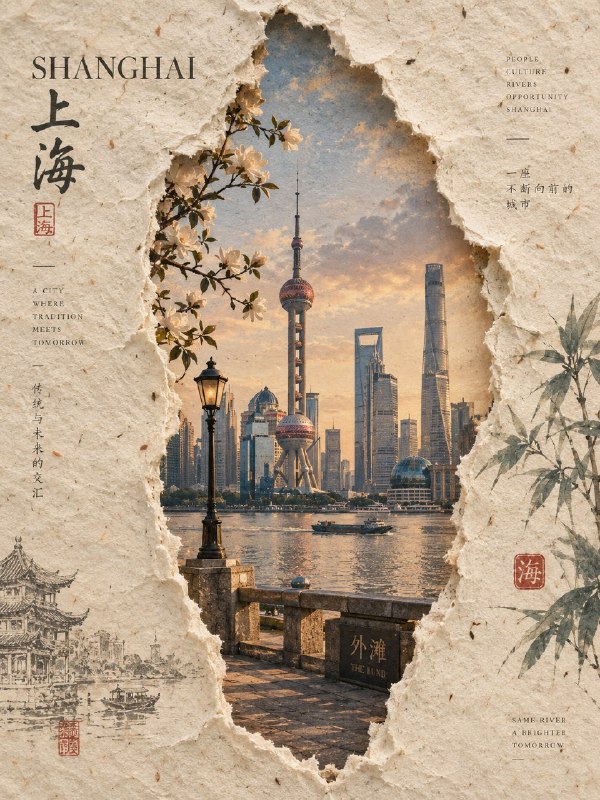
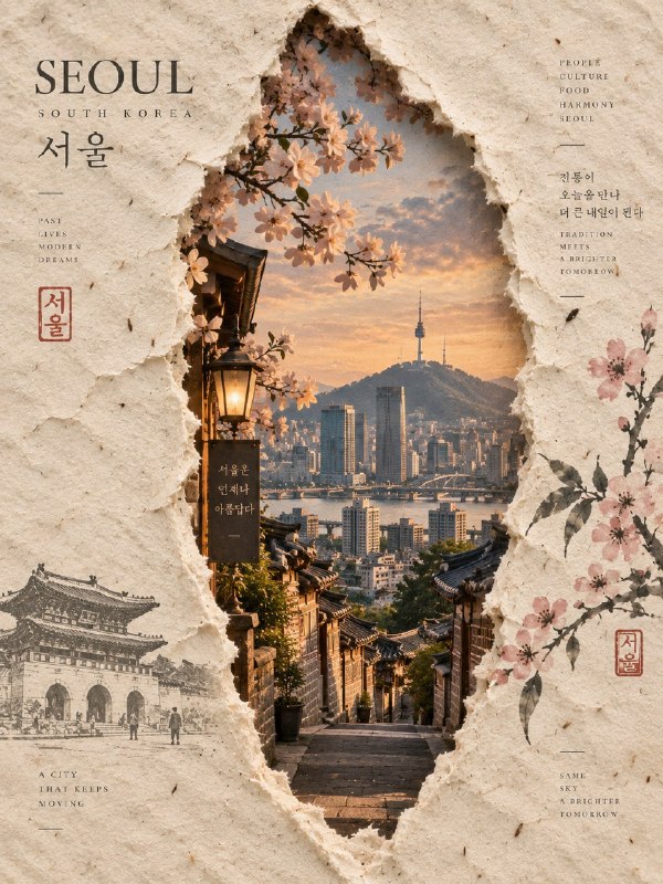
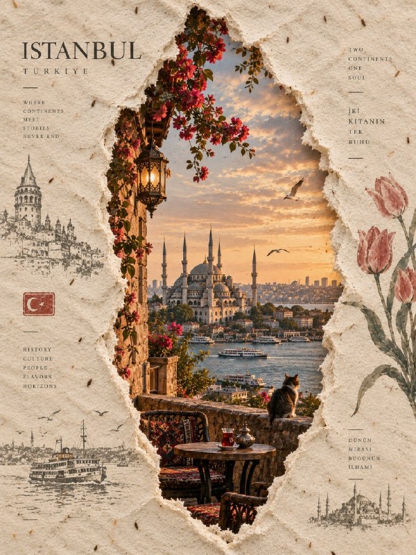
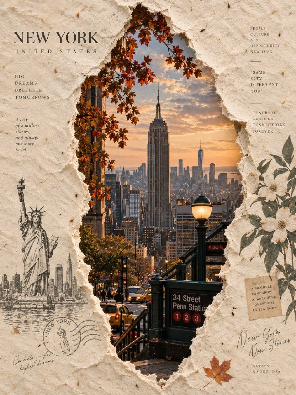
为 [国家 / 地点 / 主题] 创作一幅高端 3:4 竖版手工纸编辑艺术作品。

视觉生成
从 [国家 / 地点 / 主题] 这些词出发,创造性地构建整个构图。自动想象与该主题相关的最具代表性的视觉身份、环境、建筑、景观、人物、氛围和文化细节。

纸张
用一整张厚实、温暖象牙色的真实手工纸填满整个画面。呈现可见的桑皮纤维、细小纤维、轻微褶皱、天然斑点、淡淡污渍、不均匀的手工质感,以及柔和的物理瑕疵。

中央撕裂窗口
在纸张中央创造一个高而有机的竖向撕裂口。开口约占画面宽度的 30–40%,高度的 60–70%,形状应为细长、自然的形态。

让边缘不规则且呈自然手撕感,带有外露的白色纤维、宽度上的细微变化、略微翘起的纸边,以及精致真实的阴影。绝不要让撕裂口显得完全笔直、几何化、对称或像机器裁切。

开口内的场景
通过撕裂开口展现一幅构图优美、写实呈现的 [国家 / 地点 / 主题]。自动选择最具辨识度的地标、建筑、景观、街道、文化元素或环境特征。

被揭示的场景应与手工纸产生微妙融合,色彩柔和,带有轻微的大气淡化,并能看出场景与周围纸张纤维之间的互动。

植物细节
只在撕裂口周围放置少量干燥自然元素:几片深绿色叶子和一小簇精致的白色干花。保持稀疏而优雅,呈现可见叶脉、干燥边缘和微妙的物理阴影。绝不要形成花环或装饰边框。

在空白纸面上添加一两道极细、松散、类似铅笔的线条。它们应像安静而未完成的艺术手势,而不是可识别的图画。

文字排版
在左上方空白区域放置一句简短、有诗意的韩语短句,优雅地排列在三行以内。在右下方空白区域添加一句非常小的、有氛围感的韩语句子。

使用精致纤细的韩文编辑字体,颜色为深炭灰。所有文字都要放在空白纸面区域内。不要出现数字、日期、年份、标志、品牌、签名、水印或装饰性字体。

最终美学
安静的当代韩国编辑设计 × 可触摸的手工纸 × 有机纸张撕裂 × 精致旅行艺术 × 极简干燥植物 × 高级留白。

结果应感觉像一件真实的手工艺术印刷品,从正上方直接拍摄,具有真实的物理材料、自然阴影、柔和色彩、细腻瑕疵和高端编辑式构图。

避免
分割式布局、多个撕裂口、几何开口、光滑的机器裁切边缘、过多花朵、花环、杂乱、光 glossy 表面、塑料质感、过度饱和、人工渐变、卡通风格、3D 渲染、随机地标、过多文字、数字、标志、签名、水印或界面元素。

格式:3:4 竖版,单一统一构图。
英文提示词
Create a premium 3:4 vertical handmade-paper editorial artwork for [COUNTRY / LOCATION / SUBJECT].

VISUAL GENERATION
Build the entire composition creatively from the words [COUNTRY / LOCATION / SUBJECT]. Automatically imagine the most iconic visual identity, environment, architecture, landscape, people, atmosphere, and cultural details associated with the subject.

PAPER
Fill the entire frame with one thick, warm ivory sheet of authentic handmade paper. Show visible mulberry fibers, tiny fibers, subtle wrinkles, natural speckles, faint stains, uneven handmade texture, and soft physical imperfections.

CENTRAL TORN WINDOW
Create one tall, organic vertical tear through the center of the paper. The opening should occupy roughly 30–40% of the frame width and 60–70% of the frame height, with an elongated natural shape.

Make the edges irregular and naturally hand-torn, with exposed white fibers, small variations in width, slightly lifted paper edges, and delicate realistic shadows. Never make the tear perfectly straight, geometric, symmetrical, or machine-cut.

SCENE INSIDE THE OPENING
Reveal a beautifully composed realistic representation of [COUNTRY / LOCATION / SUBJECT] through the torn opening. Automatically select the most recognizable landmark, architecture, landscape, street, cultural element, or environmental feature.

The revealed scene should feel subtly integrated with the handmade paper, with softened colors, gentle atmospheric fading, and visible interaction between the scene and surrounding paper fibers.

BOTANICAL DETAILS
Place only a few dried natural elements around the tear: several dark green leaves and a small cluster of delicate white dried flowers. Keep them sparse and elegant, with visible veins, dried edges, and subtle physical shadows. Never form a wreath or decorative border.

Add one or two extremely thin, loose pencil-like marks across the empty paper. They should feel like quiet unfinished artistic gestures, not recognizable drawings.

TYPOGRAPHY
Place a short poetic Korean phrase in the upper-left blank area, elegantly arranged within three lines or fewer. Add one very small atmospheric Korean sentence in the lower-right blank area.

Use refined thin Korean editorial typography in deep charcoal. Keep all lettering inside the empty paper areas. No numbers, dates, years, logos, brands, signatures, watermarks, or decorative typography.

FINAL AESTHETIC
Quiet contemporary Korean editorial design × tactile handmade paper × organic paper tear × refined travel artwork × minimal dried botanicals × sophisticated negative space.

The result should feel like a real handcrafted art print photographed directly from above, with authentic physical materials, natural shadows, muted colors, delicate imperfections, and premium editorial composition.

AVOID
Split layouts, multiple tears, geometric openings, smooth machine-cut edges, excessive flowers, wreaths, clutter, glossy surfaces, plastic texture, excessive saturation, artificial gradients, cartoon styling, 3D rendering, random landmarks, excessive text, numbers, logos, signatures, watermarks, or interface elements.