完整提示词
中文提示词
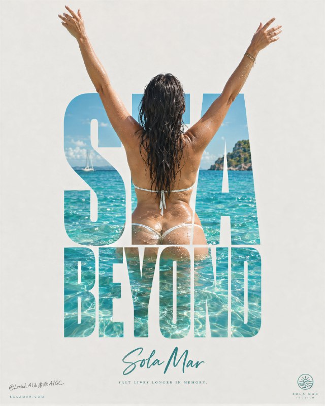
为一个名为 SOLA MAR 的虚构海岸旅游品牌创作一张高级目的地广告海报,设计成单张竖版极简活动图像,具有宏大的留白和一个居中的“字体—身体”构图。目的地本身就是产品。海报应同时具有戛纳级旅行主视觉、可收藏的编辑版画,以及画廊级图形旅游海报的质感。

整张图围绕一个明确的视觉概念构建:一位成熟女性背对镜头,站在明亮的热带海水中,双臂向上举成自由的 V 形,并与页面中心高耸的堆叠文字块完美融合。字体作为一种建筑式遮罩:摄影感的海洋场景、女性背部、湿润皮肤、深色头发和绿松石色海水都出现在巨大字母内部,而她向上举起的双臂超出字形顶部边缘,成为浅色空背景上的主要动态剪影。这种身体与字体的融合是核心构图,必须显得精确、优雅,并具有国际化标志感。

使用一种被阳光晒淡的浅暖灰纸张背景,并保留非常大面积的干净留白。在中心位置,构建一个高大的堆叠式大写标题,使用粗重的窄体字形,文字为“SEA / BEYOND”,或另一个同样有力的原创双词结构,排列成紧凑的竖向字体纪念碑。字母必须足够厚,以容纳其中鲜明的热带图像。字母内部以及下半身周围的场景应呈现高级海岸材质真实感:晶莹的绿松石色浅水、被阳光照亮的水蓝色涟漪、腰部和臀部周围微妙的折射、水面上细小闪烁的高光,以及明亮的热带清澈感。海水必须显得温暖、洁净、奢华且令人向往。

女性是真实的成熟女性形象,从背后拍摄,湿润的深色头发自然垂落在上背部。她站在清澈的热带海水中,水深到腰部或高臀部,躯干位于字母块中心,脊柱和肩胛骨与字体优雅对齐。她的双臂向上伸出文字之外,手和手腕带有精致的不对称感,使姿态显得自由而有生命力,而不是机械僵硬。解剖结构必须正确且自然:真实的头颈肩关系、自然的成熟背部和腰部结构、可信的臀部、平滑的下背到臀部过渡、真实的骨盆结构、如果可见则臀部自然丰满、柔和圆润的髋部、自然有肉感的下半身体积、细微的皮肤纹理、轻微真实的肤色变化,不要塑料般的磨皮。如果手部可见,保持五根手指解剖正确、分开、优雅且不变形。姿态必须传达自由、海盐空气、温暖和自持,绝不低俗。

光线为明亮的海岸日光,清晰但足够柔和,使海报保持高级感而不是廉价明信片感。皮肤带有发光的湿润高光和细小水滴。字体内部的海面应具有分层的青色、绿松石色和浅蓝绿色深度,阳光照在小波纹上,并在被水淹没的下半身周围呈现微妙透明感。保持字体中的水面图像鲜明,但让周围海报区域安静克制。构图必须让人感觉字体成为通往目的地的入口。

在中央字体纪念碑下方,放置目的地文字“Sola Mar”,使用优雅的手写体或精致笔刷体,颜色为冷调青绿色或海玻璃绿,居中,并且比主标题小得多。在其下方,只添加一句非常短的诗意文字,使用极小的编辑排版,例如一句关于盐、温暖和记忆的克制短语。在底部两角,只保留极简的微型元素:左侧一个低调网站,右侧一个很小的旅游标志或印章。不要额外的宣传册式信息,不要段落文案,不要拥挤的标语。

色彩层级:55% 为浅纸灰和被阳光晒淡的中性留白,25% 为明亮的热带绿松石色和水蓝色海水,15% 为温暖古铜色皮肤与深色湿发形成的对比,5% 为冷调海玻璃绿手写字强调色和极小编辑文字。图形语言必须具有奢华印刷感、居中、干净、可收藏。海报应通过巨大文字剪影在远处即可立即读懂,但在近看时通过水面细节、皮肤高光和精确的字体框定获得回报。

渲染目标:写实的奢华旅行活动、高级海报版式、以产品为主导的目的地身份、巨大字体作为图像容器、优雅的中心构图、通透留白,以及世界级印刷成品清晰度。

质量控制和结构化排除项:仅在图像区域内保持写实,女性解剖正确,自然成熟的柔和感,真实的肩部、背部、腰部、骨盆、臀部、手和手指;不要多余手指、不要缺失手指、不要融合手指、不要断裂手腕、不要扭曲脊柱、不要变形骨盆、不要塑料皮肤、不要浑浊海水、不要肮脏雾感、不要无法阅读的字体、不要随机字母、不要复制现有目的地名称、不要拥挤的宣传册版式、不要廉价度假广告风格、不要风格漂移、不要 AI 粗糙感。
英文提示词
Create a premium destination advertising poster for a fictional coastal tourism brand named SOLA MAR, designed as a single vertical minimalist campaign image with monumental negative space and one central typographic-body composition. The destination itself is the product. The poster must feel like a Cannes-level travel key visual, a collectible editorial print, and a gallery-grade graphic tourism poster at the same time.

The whole image is built around one exact visual idea: a mature woman seen from behind standing in brilliant tropical water with both arms lifted upward in a liberated V-shape, perfectly fused with a towering stacked word block at the center of the page. The typography acts as an architectural mask: the photographic ocean scene, the woman’s back, wet skin, dark hair, and turquoise water appear inside the giant letters, while her two raised arms extend beyond the top edges of the letterforms and become the main kinetic silhouette against the pale empty background. This body-and-type fusion is the hero composition and must feel exact, elegant, and internationally iconic.

Use a pale sun-bleached warm-grey paper background with very large clean negative space. At the center, build one tall stacked uppercase title in bold condensed letterforms reading "SEA / BEYOND" or another equally strong original two-word construction, arranged as a compact vertical typographic monument. The letters must be thick enough to contain a vivid tropical image within them. The scene inside the letters and around the lower body should show premium coastal material realism: crystalline turquoise shallows, sunlit aquamarine ripples, subtle refraction around the waist and hips, small glittering highlights on the water surface, and bright tropical clarity. The water must feel warm, clean, luxurious, and irresistible.

The woman is a real mature female figure, photographed from behind, with wet dark hair falling naturally down the upper back. She stands waist-deep or high-hip-deep in clear tropical sea, torso centered within the letter block, spine and shoulder blades elegantly aligned with the typography. Her arms stretch upward beyond the text with refined asymmetry in the hands and wrists so the pose feels free and alive rather than mechanical. Anatomy must be correct and natural: realistic head-neck-shoulder relationship, natural mature back and waist structure, believable hips, smooth lower-back-to-glute transition, realistic pelvic structure, naturally full buttocks if visible, soft curvy hips, natural fleshy lower-body volume, subtle skin texture, faint real skin variation, no plastic smoothing. If hands are visible, keep all five fingers anatomically correct, separated, elegant, and undistorted. The pose must communicate freedom, salt air, warmth, and self-possession, never vulgarity.

Lighting is bright coastal daylight, crisp but soft enough to keep the poster premium rather than postcard-cheap. The skin carries luminous wet highlights and fine water droplets. The sea inside the typography should have layered cyan, turquoise, and pale teal depth, with sunlight hitting the wavelets and subtle transparency around the submerged lower body. Keep the water image vivid, but let the surrounding poster field stay quiet and restrained. The composition must feel like the typography has become a portal into the destination.

Below the central typographic monument, place the destination line "Sola Mar" in an elegant hand-script or refined brush-script, cool teal or sea-glass green, centered and much smaller than the main title. Beneath it, add only one very short poetic line in tiny editorial text, something like a restrained thought about salt, warmth, and memory. At the bottom corners, keep only minimal micro-elements: a discreet website on the left and a tiny tourism mark or seal on the right. No extra brochure-style information, no paragraph copy, no cluttered taglines.

Color hierarchy: 55% pale paper-grey and sun-bleached neutral negative space, 25% luminous tropical turquoise and aquamarine water, 15% warm bronze skin and dark wet hair contrast, 5% cool sea-glass green script accent and tiny editorial microtype. The graphic language must feel luxury-print minimal, central, clean, and collectible. The poster should read immediately from far away through its giant text silhouette, but reward close viewing through water detail, skin highlights, and precise typographic framing.

Rendering target: photoreal luxury travel campaign, premium poster layout, product-dominant destination identity, giant type as image container, elegant central composition, airy negative space, and world-class print-finish clarity.

Quality control and structured exclusions: photoreal only inside the image area, correct female anatomy, natural mature softness, realistic shoulders, back, waist, pelvis, hips, hands, and fingers, no extra fingers, no missing fingers, no fused fingers, no broken wrists, no warped spine, no distorted pelvis, no plastic skin, no muddy water, no dirty haze, no unreadable typography, no random letters, no copied destination names, no cluttered brochure layout, no cheap vacation-ad styling, no style drift, no AI slop.