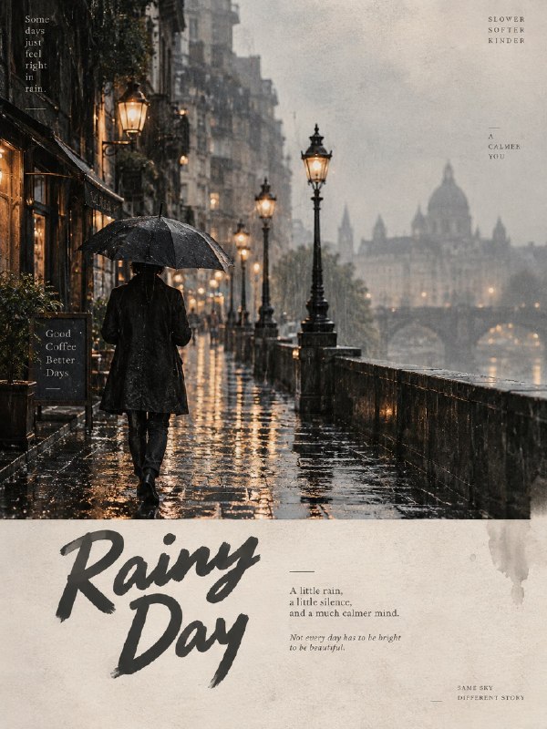
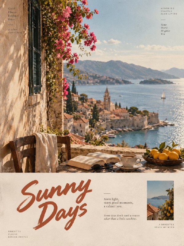
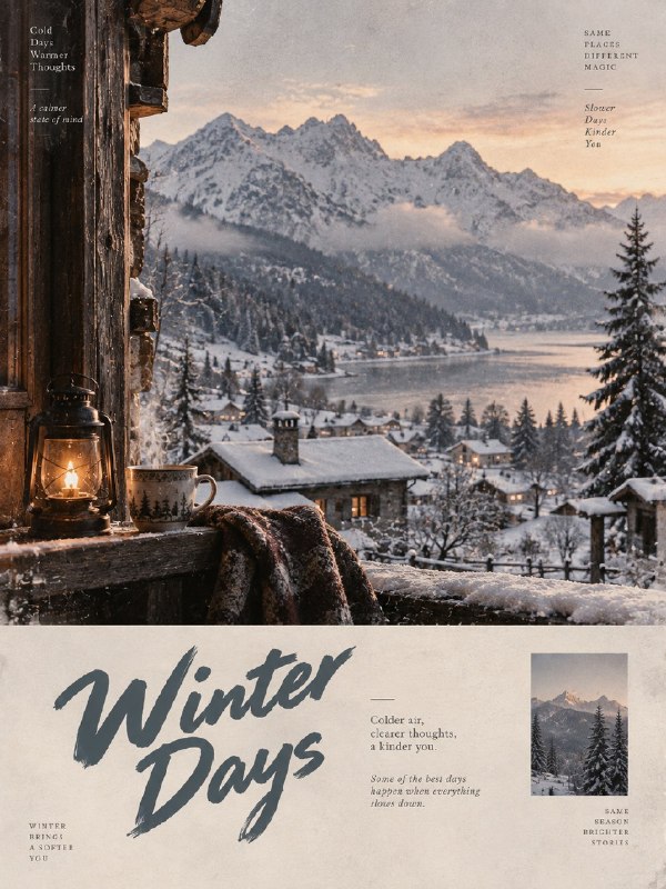
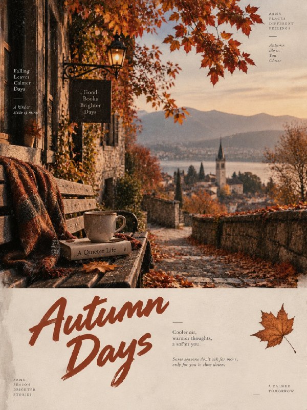
完整提示词
中文提示词
为 [国家 / 地点 / 主体] 创建一张高级的 3:4 竖版编辑艺术海报。

仅限文本生成图像。仅根据 [国家 / 地点 / 主体] 生成完整作品。不需要参考图或额外视觉输入。

自动解读该主体,并创建一个具有视觉吸引力的构图,体现其特征、氛围、外观、环境、色彩和独特视觉身份。

下方区域

使用受 [国家 / 地点 / 主体] 启发的精致背景色板,采用有限的低饱和色调,例如雾灰色、暖米色、浅卡其色、奶油白、灰粉玫瑰色或柔和灰粉色,只选择自然适合该主体的颜色。

保留约 22–30% 的连续负空间。避免复杂场景、过多物体、贴纸感元素或无意义装饰。

文字排版

基于该主体创建一套精致的编辑式文字排版系统。

自动生成一个受主体外观、情绪、动作或个性启发的简短主标题。

添加一句自然的 8–16 个英文单词句子,写得像一条含蓄的编辑注释或杂志说明文字。

主标题使用精心设计的手绘字体或复古泡泡风格字体。辅助文字使用更小、更精致的字体,例如优雅的衬线体、微妙的打字机风格,或细腻的书籍感字体。

建立清晰的层级、呼吸感和有意图的间距。文字排版应与画面融为一体,而不是简单覆盖在上面。

视觉风格

保持整体色板克制且统一,带有微妙的胶片颗粒、可触摸的纸张质感,以及柔和的印刷编辑感。

允许轻微的不对称和不完美的位置,以营造高级独立杂志美学,但不要让构图显得杂乱。

重要事项

保持主体可识别且比例自然。不要把人物或主体卡通化。

避免:
多个吉祥物、现有动画角色、品牌标志、二维码、水印、签名、乱码文字、错误的手、额外肢体、过度装饰、廉价模板、过分可爱的风格,或杂乱构图。

最终观感

完成的作品应像一本高级独立时尚杂志、当代艺术出版物或精致的编辑式 ZINE——极简、有触感、略带不完美、现代且具有视觉智慧。

严格 3:4 竖版 | 仅文本生成 | 克制色彩 | 22–30% 负空间 | 高级编辑式文字排版 | 微妙胶片颗粒与纸张印刷纹理。

仅根据 [国家 / 地点 / 主体] 自主生成全部内容。
英文提示词
Create one premium 3:4 vertical editorial art poster for [COUNTRY / LOCATION / SUBJECT].

TEXT-TO-IMAGE GENERATION ONLY. Generate the complete artwork from [COUNTRY / LOCATION / SUBJECT] alone. No reference image or additional visual input is required.

Automatically interpret the subject and create a visually compelling composition that reflects its character, atmosphere, appearance, setting, colors, and distinctive visual identity.

LOWER SECTION

Use a refined background palette inspired by [COUNTRY / LOCATION / SUBJECT], using limited low-saturation tones such as misty gray, warm beige, light khaki, cream white, dusty rose, or soft gray-pink, selecting only the colors that naturally suit the subject.

Keep approximately 22–30% continuous negative space. Avoid complicated scenery, excessive objects, sticker-like elements, or meaningless decoration.

TYPOGRAPHY

Create a sophisticated editorial typography system based on the subject.

Automatically generate a short main title inspired by the subject's appearance, mood, action, or personality.

Add one natural 8–16 word English sentence written like a subtle editorial note or magazine caption.

Use a carefully designed hand-drawn or retro bubble-style font for the main title. Use smaller refined typography for supporting text, such as an elegant serif, subtle typewriter style, or delicate book-inspired font.

Create clear hierarchy, breathing room, and intentional spacing. Typography should feel integrated into the artwork rather than simply placed on top.

VISUAL STYLE

Keep the overall palette restrained and cohesive, with subtle film grain, tactile paper texture, and a gentle printed-editorial quality.

Allow slight asymmetry and imperfect positioning to create a sophisticated independent-magazine aesthetic without making the composition messy.

IMPORTANT

Keep the main subject recognizable and naturally proportioned. Do not cartoonize the person or subject.

Avoid:
multiple mascots, existing animated characters, brand logos, QR codes, watermarks, signatures, gibberish text, incorrect hands, extra limbs, excessive decoration, cheap templates, overly cute styling, or cluttered compositions.

FINAL LOOK

The finished artwork should feel like a premium independent fashion magazine, contemporary art publication, or sophisticated editorial ZINE—minimal, tactile, slightly imperfect, modern, and visually intelligent.

STRICT 3:4 VERTICAL | TEXT-ONLY GENERATION | RESTRAINED COLORS | 22–30% NEGATIVE SPACE | PREMIUM EDITORIAL TYPOGRAPHY | SUBTLE FILM GRAIN & PAPER PRINT TEXTURE.

Generate everything autonomously from [COUNTRY / LOCATION / SUBJECT] alone.