完整提示词
中文提示词
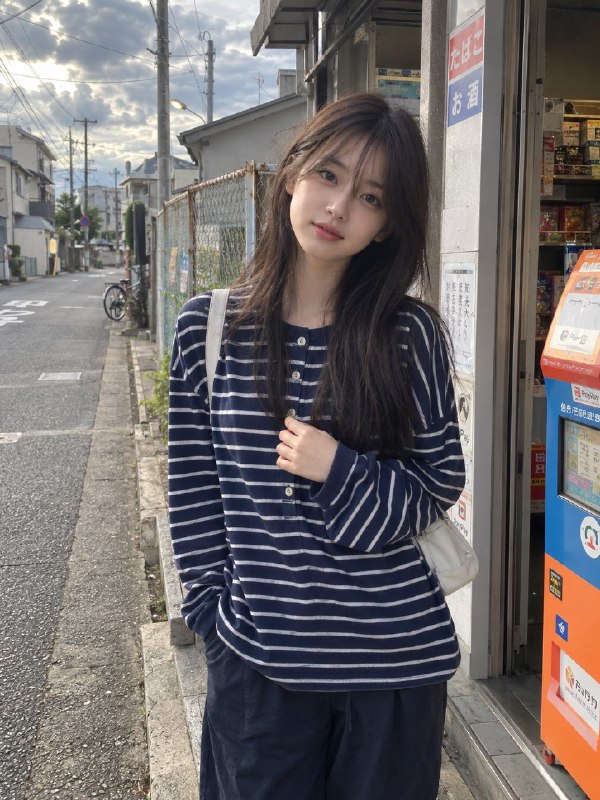
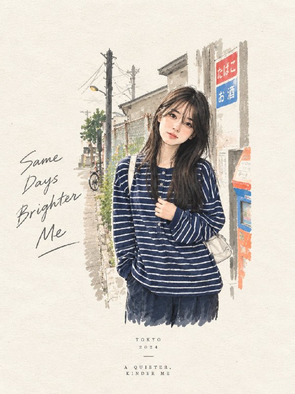
为每张上传的照片创建一张高级编辑艺术海报,将每张图像都视为独立构图,绝不把多张照片合并在一起。使用严格的 3:4 竖版格式,将画布分成上下两个完全相等的水平部分:上半部分应保持对原图忠实的、照片级真实的呈现,保留主体的准确身份、面部特征、比例、姿势、服装、物体、构图、光线、阴影、情绪和自然色彩,只在必要时通过精致的编辑式调色和无缝的环境延展进行增强;下半部分应将视觉故事转化为一种完全不同的艺术诠释——一件小巧、精心构图的手工混合媒介艺术作品,居中放置在大面积温暖象牙色留白中,占下半区不超过 10–20%,使用富有表现力的墨水速写、层叠的类似水粉的色块、细微的拼贴纹理、撕纸边缘、不完美的笔触、可见的纤维、柔和的颜料变化和迷人的人为不完美感,同时保留原照片中最易识别的轮廓、姿态、物体和情感叙事。从每张照片中提取最多四种主导的和谐色彩,并将其重新诠释为柔和、成熟的调色板。只有在确实能增强构图时,才加入偶尔出现的低调编辑字体,例如诗意标题、地点、日期或单个词。整体结果应像一本值得收藏的当代艺术出版物封面——极简、诗意、有触感、优雅、情绪安静、视觉独特,并且与其原始照片有明确无误的联系。
英文提示词
Create a premium editorial art poster for every uploaded photograph, treating each image as its own independent composition and never merging multiple photos together. Use a strict 3:4 vertical format with the canvas split into two perfectly equal horizontal halves: the upper half should remain a faithful, photorealistic presentation of the original image, preserving the subject’s exact identity, facial features, proportions, pose, clothing, objects, composition, lighting, shadows, mood, and natural colors, enhanced only with sophisticated editorial color grading and seamless environmental extension where necessary; the lower half should transform the visual story into an entirely different artistic interpretation—a tiny, carefully composed handmade mixed-media artwork centered within expansive warm ivory negative space, occupying no more than 10–20% of the lower section, using expressive ink sketching, layered gouache-like color fields, subtle collage textures, torn-paper edges, imperfect brushwork, visible fibers, soft pigment variations, and charming human imperfections while retaining the most recognizable silhouette, gesture, objects, and emotional narrative from the original photo. Extract up to four dominant harmonious colors from each photograph and reinterpret them in a muted, sophisticated palette. Add only occasional understated editorial typography when it genuinely enhances the composition, such as a poetic title, place, date, or single word. The overall result should feel like a collectible contemporary art publication cover—minimal, poetic, tactile, elegant, emotionally quiet, visually distinctive, and unmistakably connected to its original photograph.